Progetto per i social media che rendono un marchio immediatamente riconoscibile / Social Media Designs That Make a Brand Instantly Recognisable
Progetto per i social media che rendono un marchio immediatamente riconoscibile / Social Media Designs That Make a Brand Instantly Recognisable
Segnalato dal Dott. Giuseppe Cotellessa / Reported by Dr. Giuseppe Cotellessa

Il design più prezioso per i social media potrebbe essere quello in cui nessuno ha bisogno di vedere il logo.
Può sembrare un po' perverso, considerando che abbiamo passato decenni a posizionare loghi negli angoli, ad ampliare le regole di spazio bianco e a produrre documenti di linee guida del marchio così pesanti da poter tenere aperta una porta tagliafuoco. Ma i social media sono un ambiente particolarmente spietato per il branding tradizionale. Le persone non si imbattono nella tua griglia Instagram accuratamente curata in modo isolato. Si imbattono in un post mentre scorrono la foto delle vacanze di un amico, una clip di ultime notizie, un creator che si lamenta di una compagnia aerea, tre video di cani e un ex compagno di scuola che annuncia il lancio del suo "marchio personale". Il tuo design raramente riceve la cortesia di essere studiato. Ha a disposizione millisecondi per annunciare la sua provenienza.
Questo cambia tutto. Un branding efficace sui social media non si limita ad applicare in modo coerente un logo, un font e una palette di colori a una serie di modelli. Si tratta piuttosto di creare sufficienti elementi visivi, verbali e comportamentali distintivi da far sì che le persone inizino a riconoscere il brand quasi istintivamente. La combinazione di colori risulta familiare. Il ritaglio risulta familiare. Il movimento del testo risulta familiare. Lo stile delle illustrazioni, la fotografia, l'umorismo o la piccola, strana abitudine visiva risultano familiari. Idealmente, quando qualcuno trova il logo, sa già di chi è il post che sta guardando.
Questa è la differenza tra visibilità e riconoscimento. La notorietà del marchio sui social media si basa essenzialmente sulla conoscenza dell'esistenza del marchio da parte del pubblico. Il riconoscimento è più specifico: le persone riescono a identificarlo quando si imbattono nei suoi elementi, contenuti o comportamenti? Si può generare un'enorme notorietà attraverso investimenti pubblicitari, influencer o un post virale, ma non riuscire comunque a costruire un marchio riconoscibile se ogni contenuto successivo sembra provenire da qualcun altro.
I brand che riescono a distinguersi davvero sui social tendono a comprendere questa differenza. Non si limitano a riempire i feed, ma insegnano costantemente alle persone qual è il loro aspetto, il loro suono e il loro comportamento.
Il riconoscimento avviene prima del logo
La scienza alla base di questo concetto è ben consolidata. L'Istituto Ehrenberg-Bass definisce gli elementi distintivi di un marchio come elementi non legati al nome stesso, quali colori, caratteri, forme, parole e suoni, che possono innescare il riconoscimento del marchio una volta diventati sufficientemente noti e univocamente associati ad esso. In altre parole, un logo è solo una delle vie per tornare alla memoria. Se il resto dell'identità del marchio è abbastanza forte, il riconoscimento può avvenire prima ancora che qualcuno legga il nome.
Per i social media, questo è di fondamentale importanza perché gli ambienti sono visivamente molto compressi. Un cartellone pubblicitario può contenere sei parole, un'immagine gigante e catturare l'attenzione per pochi secondi. Un post sui social si inserisce in un flusso infinito di scelte creative altrui. Se il tuo unico elemento distintivo è un piccolo logo nell'angolo in basso a destra, stai chiedendo a una delle parti meno interessanti della composizione di svolgere quasi tutto il lavoro di branding.
L'articolo di Creativepool sulle competenze più importanti per costruire marchi distintivi sottolinea un concetto più ampio: la riconoscibilità si costruisce attraverso scelte ripetute, non con abbellimenti. I marchi che diventano distintivi sanno cosa mantenere, cosa far evolvere e cosa non modificare semplicemente perché una nuova estetica è diventata di moda. Questa disciplina diventa particolarmente preziosa sui social media, dove i team sono costantemente sotto pressione per reagire, sperimentare e produrre di più.
Si può notare quanto possa diventare potente un singolo elemento distintivo quando viene utilizzato con sicurezza. L'identità visiva di Brat , il marchio di Charli XCX , si è ridotta a ingredienti di una semplicità quasi comica: verde acido, tipografia diretta e un atteggiamento deciso. Eppure, questa coerenza ha permesso all'estetica di diffondersi sui social media, rimanendo immediatamente riconoscibile, anche quando altri l'hanno ricreata e reinterpretata. L'analisi di Creativepool su come Brat sia diventato il marchio dell'estate 2024 ci ricorda che la riconoscibilità non richiede sempre complessità. A volte, un singolo elemento, utilizzato con costanza e sufficiente sicurezza, diventa più potente di un sistema elaborato e raffinato.
Spotify offre un esempio diverso. Il suo passaggio a immagini bicolore e a un sistema cromatico molto più ampio ha conferito al marchio un linguaggio visivo in grado di adattarsi a una varietà pressoché illimitata di musicisti, generi, playlist e momenti culturali senza perdere la propria identità. L'artista poteva cambiare. L'immagine poteva cambiare. Il colore poteva cambiare. Il trattamento di base faceva sì che il lavoro risultasse coerente. Creativepool ha seguito questo cambiamento quando Spotify ha introdotto il suo sistema visivo più espressivo , sottolineando come la flessibilità dell'identità fosse proprio ciò che le permetteva di passare dagli schermi alla stampa, agli ambienti e ad altre esperienze.
Questo è il tipo di approccio che i social media richiedono. Non un modello predefinito in cui ogni post deve essere forzatamente inserito, ma una grammatica riconoscibile che permetta al brand di comunicare messaggi diversi senza dare l'impressione che qualcun altro abbia preso il controllo dell'account.
La coerenza non significa che ogni post debba avere lo stesso aspetto.
Questo è forse il malinteso più comune in materia di identità di marca sui social media. Un team decide che la coerenza è importante, crea sei modelli e poi passa i successivi tre anni a far sì che ogni contenuto appaia vagamente identico. Stesso rettangolo colorato. Stesso carattere tipografico. Stessa posizione del logo. Stessa composizione. Alla fine, il marchio diventa coerente più o meno come lo è la carta da parati nella sala d'attesa di un dentista.
Il riconoscimento richiede ripetizione, ma ripetizione non significa necessariamente uniformità.
Una buona identità sociale distingue gli elementi fissi da quelli flessibili. Gli elementi fissi possono includere una particolare famiglia tipografica, il comportamento dei colori, il trattamento delle fotografie, lo stile delle illustrazioni, il principio del movimento, il dispositivo di inquadratura, l'intonazione, l'effetto sonoro o il tono di voce. Gli elementi flessibili possono quindi reagire al contenuto, alla piattaforma e al momento culturale senza forzare ogni idea in uno schema predefinito.
Pensatela più come una lingua che come un modello. L'inglese ha regole, strutture e un vocabolario riconoscibile, ma questo non significa che ogni frase debba dire la stessa cosa. Una forte identità sui social media funziona in modo simile. Ci dovrebbe essere un DNA condiviso sufficiente a far sì che i contenuti risultino coerenti, pur lasciando la giusta libertà affinché un annuncio, un meme, un post di reclutamento, il lancio di un prodotto, una battuta reattiva e un video di una campagna possano svolgere funzioni diverse.
L'articolo di Creativepool sul potere della personalità del marchio coglie perfettamente questo equilibrio. Sostiene la necessità di contenuti social costruiti attorno a una solida base strategica, pur mantenendo un margine di manovra per reazioni, sperimentazione e partecipazione culturale. La proporzione esatta è meno importante del principio: la rigidità rende un marchio stantio, ma la flessibilità eccessiva ne distrugge la riconoscibilità.
Liquid Death dimostra quanto ampio e flessibile possa diventare quel territorio una volta che le fondamenta sono abbastanza solide. Una lattina d'acqua con un design che sembra uscito da un festival heavy metal, un tono di voce aggressivamente comico, illustrazioni macabre, prodotti assurdi, collaborazioni con celebrità e contenuti social volutamente ridicoli: tutto questo appartiene allo stesso universo perché il marchio ha una personalità ben definita. L'analisi di Creativepool su come Liquid Death ha trasformato una lattina d'acqua in un marchio da 1,4 miliardi di dollari mostra come l'azienda abbia deliberatamente integrato la condivisibilità nel prodotto e nella comunicazione fin dall'inizio.
È importante sottolineare, però, che la lezione non è che tutti dovrebbero comportarsi come Liquid Death. Se domani Barclays iniziasse a parlare come un account di meme death metal, probabilmente la gente si porrebbe delle domande. La lezione è che i brand social più forti creano un'identità sufficientemente chiara da guidare migliaia di piccole decisioni creative. Una volta che quell'identità esiste, la varietà diventa più sicura perché c'è qualcosa alla base che la tiene unita.
Progetta il comportamento, non solo la tavolozza dei colori.
Un'identità sociale moderna deve pensare in termini di movimento.
Come appare il testo sullo schermo? Le didascalie si posizionano automaticamente, scorrono, rimbalzano o si muovono appena? I tagli sono decisi o fluidi? La telecamera è vicina alle persone o mantiene le distanze? I filmati generati dagli utenti sono rifiniti fino a sembrare pubblicità, o la loro imperfezione è parte integrante del marchio? Cosa succede nel primo mezzo secondo di un Reel? Che aspetto ha un'infografica quando deve trasformarsi in un carosello? Come fa l'identità visiva a sopravvivere in un video verticale quando non c'è un posto adatto dove posizionare il logo, accuratamente posizionato?
Il movimento stesso può diventare distintivo. Lo stesso vale per il ritmo di montaggio, le transizioni, l'inquadratura e il suono. La recente identità sonora dell'Eurovision è un buon esempio di come i brand possano pensare oltre il mero riconoscimento visivo. Il brief era volutamente modulare, con l'obiettivo di creare segnali audio che potessero funzionare sia per la trasmissione televisiva che per i contenuti digitali, in modo che il materiale creato dai fan e quello ufficiale avessero una connessione sonora più chiara con l'Eurovision. L'articolo di Creativepool sul DNA sonoro dell'Eurovision descrive l'obiettivo come la creazione di riconoscibilità anche in assenza di un marchio visivo.
Anche TikTok ha affrontato lo stesso problema quando ha creato un'identità sonora pensata, in parte, per identificare i contenuti originari di TikTok anche al di fuori della piattaforma. L'articolo "Behind the Brand" di Creativepool sull'identità sonora di TikTok dimostra perché questo sia importante: quando i contenuti si spostano tra le piattaforme, è fondamentale che anche gli elementi riconoscibili li accompagnino.
I sistemi di social design più efficaci sono quindi sempre più multisensoriali. Il colore è importante. La tipografia è importante. Ma lo sono anche il movimento, il suono, la fotografia, il linguaggio e persino il modo in cui un brand risponde ai commenti. La tua identità sui social media non è semplicemente l'elemento che un designer inserisce nell'immagine. È il modello complessivo che le persone imparano ad associare a te.
Crea per il feed, non per il brand - Linee guida in PDF
I social media mettono inoltre in luce la differenza tra progettare qualcosa di esteticamente gradevole e progettare qualcosa che funzioni correttamente, anche a contatto con il pollice dell'utente.
Non si tratta sempre della stessa abilità.
Layout complessi possono scomparire sullo schermo di un telefono. La tipografia sottile diventa illeggibile. Fotografie accuratamente disposte vengono coperte dalle interfacce delle piattaforme. Un titolo di 14 parole che appariva perfettamente bilanciato sul monitor del designer diventa microscopico all'interno di un Reel. Elementi creati appositamente per una presentazione impeccabile possono crollare in modo piuttosto spettacolare una volta che Instagram, TikTok, LinkedIn o YouTube vi aggiungono pulsanti, didascalie e elementi dell'interfaccia.
Un design social riconoscibile richiede una gerarchia. Spesso si ha solo una frazione di secondo per capire cosa sta guardando qualcuno, e l'elemento distintivo più importante del marchio non dovrebbe richiedere uno scavo archeologico.
Questo non significa automaticamente mettere il logo all'inizio di ogni cosa. L'articolo di Creativepool sui migliori utilizzi dei meme nella pubblicità cita una ricerca sulla pubblicità social di breve formato che mostra l'importanza di elementi distintivi del marchio fin dalle prime fasi. Il principio utile è più ampio dei meme: tutto ciò che rende il tuo marchio riconoscibile deve arrivare abbastanza velocemente da essere rilevante. Potrebbe trattarsi del prodotto stesso, di un personaggio, di un colore, di una frase, di un comportamento visivo insolito o di una voce riconoscibile.
Ecco perché la domanda utile non è necessariamente "Le persone riescono a riconoscere il marchio senza vedere il logo?", come se nascondere il logo fosse un trucco creativo. La domanda è piuttosto se l'identità visiva contenga sufficienti altri elementi distintivi, in modo che il logo non svolga tutto il lavoro.
Prova a rimuoverlo.
Se un post improvvisamente sembra poter appartenere a uno qualsiasi di venti concorrenti, questo è un segnale d'allarme.
Le migliori identità sociali lasciano spazio alla cultura
Qui si presenta un'ulteriore tensione, perché i social media non premiano i brand semplicemente per la loro capacità di ripetersi in modo impeccabile. Le piattaforme sono ambienti dinamici. I meme appaiono e scompaiono. I formati cambiano. I creatori introducono nuovi linguaggi visivi. Il pubblico sviluppa battute, comportamenti e convenzioni molto più velocemente di quanto la maggior parte dei cicli di revisione delle linee guida del brand sia mai stata progettata per gestire.
Un marchio riconoscibile deve quindi essere in grado di partecipare senza diventare indistinguibile da tutti gli altri partecipanti.
È proprio in questi casi che inseguire le tendenze spesso danneggia la notorietà del marchio sui social media, anziché migliorarla. Un meme ha successo, quindi venti marchi lo ricreano utilizzando esattamente lo stesso formato, linguaggio e immagine. Il contenuto sembra nativo della piattaforma, ma sempre più nativo di chiunque . Eliminando il nome del profilo, nulla appartiene in modo univoco all'azienda.
Creativepool ha scritto ampiamente su questo argomento perché rappresenta una delle sfide centrali del marketing sui social media moderno. In "Mischief Mode" , Mira Kopolovic di We Are Social descrive un web in cui i brand cercano sempre più di operare all'interno di comunità frammentate e in rapida evoluzione, immerse nella cultura surreale di internet. L'opportunità è evidente, ma altrettanto grave è il rischio di arrivare in ritardo e di appropriarsi dello scherzo altrui senza comprenderlo.
Una forte identità sociale fornisce al marchio un filtro. Invece di chiedersi "Come possiamo sfruttare questa tendenza?", il team può chiedersi "Cosa potremmo fare con questa tendenza?". A volte la risposta sarà qualcosa di distintivo. Altre volte la risposta sarà il nulla assoluto.
La capacità di restare in disparte è sottovalutata.
Ryanair, Liquid Death, Surreal e altri marchi associati a voci social distintive funzionano perché i loro post generalmente appaiono come un'estensione di identità che già possiedono. Copiare il comportamento senza una solida base strategica significa trasformarsi rapidamente nell'ennesimo team di marketing che finge di essere un adolescente insolitamente sarcastico.
Il riconoscimento si costruisce quando la flessibilità culturale si manifesta all'interno di un universo di marca stabile, non quando l'universo di marca viene abbandonato ogni mattina in favore di qualsiasi cosa sia apparsa su TikTok durante la notte.
Un sistema di design per i social media ha bisogno di più dei semplici modelli
I modelli sono utili. Rendono la produzione più rapida, riducono le decisioni di design superflue e aiutano i team più numerosi a mantenere una coerenza ragionevole. Sono particolarmente preziosi per i formati ricorrenti come annunci, citazioni, informazioni sui prodotti, contenuti per il reclutamento o serie editoriali periodiche.
Ma i modelli sono strumenti di produzione, non strategie di identità.
Un sistema sociale robusto necessita di un insieme più ampio di regole che governino ciò che rimane riconoscibile anche quando il modello cambia. Ciò potrebbe significare stabilire un comportamento tipologico primario e secondario, anziché prescrivere un layout identico. Potrebbe definire quanto strettamente vengono ritagliate le fotografie, come le illustrazioni interagiscono con la tipografia o come vengono gestite le proporzioni dei colori. Potrebbero esserci regole per il movimento, i titoli, la visualizzazione dei dati, le miniature, le didascalie e i contenuti nativi della piattaforma.
Fondamentale è che spieghi anche cosa non fare.
Quali tendenze visive non si addicono al marchio? Quali colori non dovrebbero mai dominare? Quanto dovrebbero essere filtrate le immagini? Quanto testo ci rappresenta? Dobbiamo coprire i volti con il testo? Dobbiamo usare le emoji? Dobbiamo usare immagini di repertorio? Che suono ha l'umorismo? Quanto è raffinato il raffinato?
Queste regole negative possono essere altrettanto preziose di quelle positive perché impediscono che un'identità riconoscibile si dissolva gradualmente attraverso centinaia di decisioni individualmente ragionevoli.
Questo aspetto è ancora più importante ora che i team social possono generare e gestire i contenuti a una velocità straordinaria. L'articolo di Creativepool sul perché l'originalità stia diventando sempre più preziosa in un mondo sommerso dai contenuti sottolinea un punto scomodo: i brand possono creare più materiale che mai senza necessariamente avere più contenuti di valore. Una maggiore produzione non genera automaticamente una maggiore identità. A volte, crea semplicemente più opportunità di essere incoerenti.
Il sistema di progettazione dovrebbe quindi facilitare le buone decisioni, non semplicemente velocizzare la produzione.
Come si mantiene la coerenza di un marchio su diverse piattaforme?
La risposta sbagliata è solitamente quella di pubblicare esattamente la stessa cosa ovunque.
LinkedIn non è Instagram con un uso leggermente più entusiasta della parola "leadership". TikTok non è una versione verticale di YouTube. Le Storie di Instagram si comportano in modo diverso dal feed principale. Una miniatura di YouTube deve funzionare in modo diverso da una copertina di un carosello. Anche quando l'idea creativa rimane coerente, la realizzazione deve rispettare il modo in cui le persone utilizzano ciascuna piattaforma.
Il trucco sta nell'adattare il formato senza modificarne l'identità.
L'immagine di una campagna pubblicitaria può trasformarsi in un post statico su LinkedIn, un video su Instagram, un'interpretazione volutamente grezza realizzata da un creator su TikTok e una combinazione di miniatura e filmato su YouTube. L'elemento grafico cambia. Il punto di vista, gli elementi distintivi e il pensiero creativo di fondo devono però rimanere invariati.
Questo è anche il motivo per cui la distribuzione dovrebbe sempre più essere parte integrante del processo creativo, anziché essere considerata una fase successiva al completamento del lavoro. L'articolo di Creativepool sul perché la distribuzione dei contenuti stia diventando importante quanto la creatività stessa sostiene che i brand devono ora pensare simultaneamente a ciò che creano e agli ambienti in cui le persone lo fruiranno.
La coerenza tra le piattaforme non dovrebbe quindi significare un'esecuzione identica, bensì un riconoscimento coerente.
Chi passa da un account TikTok all'altro, passando per LinkedIn e Instagram, dovrebbe avere la sensazione di trovarsi di fronte allo stesso brand, che si comporta in modo appropriato in tre contesti diversi.
Come fai a sapere se il tuo marchio sui social media è riconoscibile?
Puoi iniziare con un esercizio tutt'altro che scientifico, ma sorprendentemente rivelatore: copri il logo e il nome utente.
Analizza venti contenuti recenti decontestualizzati. L'insieme dà ancora l'impressione di provenire da un unico marchio? E, soprattutto, qualcuno al di fuori del team marketing sarebbe in grado di riconoscerlo?
Rendi il test più difficile. Mescola diversi elementi grafici tra i concorrenti. Riducili alle dimensioni per dispositivi mobili. Elimina le didascalie. Mostrali brevemente invece di permettere alle persone di studiarli. Cosa sopravvive?
Le risorse più solide sono solitamente quelle che continuano a suscitare riconoscimento anche quando altre informazioni scompaiono.
Una misurazione accurata va oltre. Ehrenberg-Bass misura gli elementi distintivi sia in base alla prevalenza, ovvero quanti acquirenti della categoria associano un elemento al marchio, sia in base all'unicità, ovvero se lo associano prevalentemente a quel marchio piuttosto che ai concorrenti. Questo è utile perché i professionisti del marketing spesso non sono in grado di valutare correttamente la propria distintività. Un colore potrebbe sembrare un'identità unica all'interno del team del marchio perché tutti lo hanno visto per tre anni, mentre i consumatori associano esattamente lo stesso colore a quattro concorrenti.
L'analisi dei social media può fornire prove a supporto, ma i "mi piace" da soli non misurano la notorietà. È importante considerare l'engagement ripetuto, il traffico diretto, le ricerche con il nome del brand, la crescita dei follower dopo campagne specifiche, le menzioni che utilizzano il linguaggio del brand, la riproduzione organica di contenuti visivi e il comportamento del pubblico che indica che le persone comprendono la battuta o il riferimento senza bisogno di spiegazioni.
Forse il segnale più interessante si ha quando il pubblico inizia a utilizzare direttamente i tuoi contenuti.
Quando un colore, una frase, un carattere, un formato o un tono diventano elementi che le persone imitano, citano o rielaborano, l'identità comincia a vivere al di là del team di progettazione.
Trovare il Social Media Manager o il Designer giusto tramite Creativepool
È proprio in questo contesto che i brand devono essere molto precisi riguardo al problema che stanno cercando di risolvere assumendo qualcuno, perché "abbiamo bisogno di qualcuno che si occupi dei social media" può descrivere circa diciassette posizioni lavorative diverse.
Se la questione principale è di natura strategica, probabilmente avrete bisogno di un social media manager o di uno specialista senior dei social media. Queste figure dovrebbero occuparsi di canali, pubblico, pilastri dei contenuti, gestione della community, pianificazione, opportunità culturali, analisi e dell'evoluzione del brand nel tempo. Creativepool offre una directory dedicata ai social media manager , dove è possibile esplorare i profili attraverso portfolio, reel, CV ed esperienze, anziché basarsi esclusivamente sulle qualifiche professionali. Sono inoltre disponibili social media director per progetti che richiedono una leadership strategica di livello superiore e social media executive per esigenze più operative.
Se la strategia è valida ma il brand non risulta riconoscibile nel feed, il problema potrebbe risiedere nel design piuttosto che nella gestione. La directory di digital designer di Creativepool è un utile punto di riferimento per trovare specialisti abituati a progettare per schermi, mentre la directory più ampia di graphic designer include professionisti che lavorano su identità visiva, campagne e grafica digitale. Creativepool stessa consiglia di selezionare i candidati in base alla pertinenza del portfolio piuttosto che al solo titolo di lavoro, aspetto particolarmente importante in questo caso, poiché un portfolio editoriale o di packaging di pregio non dimostra automaticamente la comprensione del movimento, della gerarchia dei contenuti su dispositivi mobili o delle implacabili esigenze produttive dei social media.
Molto spesso, però, servono entrambi.
Un brillante social media manager può capire esattamente cosa desidera il pubblico, ma trovarsi comunque in difficoltà se il sistema di identità visiva non offre elementi distintivi su cui lavorare. Un ottimo designer può creare modelli splendidi che però falliscono perché nessuno ha definito con precisione cosa il brand dovrebbe effettivamente comunicare ogni settimana. La soluzione migliore è spesso quella di un social media strategist o social manager che lavora a fianco di un designer che conosce i sistemi di branding, con il supporto di animatori, copywriter, creatori o addetti alla produzione laddove il contenuto lo richieda.
Quando esaminate i portfolio di Creativepool, cercate la coerenza tra i diversi lavori, piuttosto che venti splendide versioni di una singola campagna. Il designer è in grado di rendere un brand riconoscibile attraverso video, caroselli, grafiche statiche e contenuti reattivi? Il social media manager dimostra competenze che vanno oltre il semplice numero di follower? Sa spiegare il ragionamento alla base di un sistema di contenuti, come ha reagito ai cambiamenti culturali e come il lavoro ha supportato il brand nel suo complesso, anziché limitarsi a riempire un calendario editoriale?
La cosa più importante è descrivere il problema di identità visiva, non solo i requisiti di produzione. "Abbiamo bisogno di 20 post al mese su Instagram" non fornisce quasi nessuna informazione utile al team creativo. "I nostri post sono di qualità individuale, ma sembrano intercambiabili con quelli della concorrenza, e abbiamo bisogno di un sistema riconoscibile che il nostro team interno possa utilizzare su Instagram, TikTok e LinkedIn" è un problema che qualcuno può effettivamente risolvere.
È importante fare questa distinzione prima di assumere chiunque.
L'obiettivo è il riconoscimento, non l'uniformità.
La migliore strategia di branding sui social media crea uno strano paradosso: è sufficientemente coerente da diventare familiare, ma anche abbastanza flessibile da rimanere interessante.
Ciò richiede più disciplina che la semplice ripetizione di un logo.
Il colore deve appartenere a qualcosa. La tipografia deve avere un comportamento. La fotografia deve avere un punto di vista. Il movimento deve avere un ritmo. Il tono deve avere dei limiti. Il team social deve avere sufficiente libertà per rispondere al mondo senza doversi svegliare ogni mattina e inventare un marchio completamente nuovo.
Alla fine, le persone dovrebbero essere in grado di riconoscerti attraverso frammenti di informazioni:
- Una particolare coltura.
- Una frase familiare.
- Una combinazione di colori.
- Un personaggio.
- Un suono.
- Il modo in cui inizia una didascalia.
- Il modo in cui si muove il testo.
- Magari anche il tipo di battuta che faresti tu.
È in quel momento che un'identità sui social media inizia a fare più che semplicemente rendere ordinato il proprio feed. Inizia a costruire memoria.
E in definitiva, ciò che tutti quei contenuti dovrebbero lasciare dietro di sé è la memoria. La persona media non vedrà mai il tuo calendario editoriale completo. Non apprezzerà l'elegante logica della tua libreria di modelli né ammirerà il documento esaustivo delle linee guida del marchio che si trova nella tua cartella condivisa. Vedrà un post per due secondi mentre fa qualcos'altro.
La domanda è cosa possano ottenere loro quei due secondi.
Se la risposta è semplicemente "un bel contenuto", hai prodotto qualcosa di interessante.
Se la risposta è "So esattamente di chi si tratta", allora hai costruito un marchio.
ENGLISH
The most valuable piece of social media design might be the one where nobody needs to see the logo.
That sounds slightly perverse when we’ve spent decades putting logos in corners, expanding clear-space rules and producing brand-guideline documents heavy enough to prop open a fire door. But social media is a particularly unforgiving environment for conventional branding. People don’t encounter your carefully curated Instagram grid in isolation. They encounter one post while scrolling past a friend’s holiday photograph, a breaking-news clip, a creator complaining about an airline, three videos of dogs and somebody they went to school with announcing the launch of their “personal brand”. Your design rarely receives the courtesy of being studied. It gets milliseconds to announce where it came from.
That changes the job. Strong social media branding isn’t simply about applying a logo, font and colour palette consistently across a series of templates. It is about creating enough distinctive visual, verbal and behavioural cues that people begin recognising the brand almost instinctively. The colour treatment feels familiar. The crop feels familiar. The way the type moves feels familiar. The illustration style, photography, humour or strange little visual habit feels familiar. Ideally, by the time somebody finds the logo, they already know whose post they’re looking at.
That is the difference between visibility and recognition. Brand awareness on social media is essentially whether people know that the brand exists. Recognition is more specific: can they identify it when they encounter its assets, content or behaviour? You can generate enormous awareness through media spend, influencers or a viral post and still fail to build a recognisable brand if every subsequent piece of content looks like it came from somebody else.
The brands that become truly distinctive on social tend to understand that difference. They are not simply filling feeds. They are steadily teaching people what the brand looks, sounds and behaves like.
Recognition Happens Before the Logo
The science behind this is well established. The Ehrenberg-Bass Institute describes distinctive brand assets as non-brand-name elements such as colours, characters, shapes, words and sounds that can trigger brand recognition once they become sufficiently well known and uniquely associated with that brand. In other words, a logo is only one route back to memory. If the rest of your identity is strong enough, recognition can happen before anybody reads the name.
For social media, that matters enormously because the environments are so visually compressed. A billboard might have six words, a giant image and several seconds of attention. A social post sits inside an endless conveyor belt of other people’s creative decisions. If your only distinctive element is a tiny logo in the bottom right-hand corner, you are asking one of the least interesting parts of the composition to do almost all of the branding work.
Creativepool’s feature on the most important skills for building distinctive brands makes the broader point that recognisability is built through repeated choices rather than decoration. The brands that become distinctive know what to keep, what to evolve and what to resist changing simply because a new aesthetic has become fashionable. That discipline becomes particularly valuable on social, where teams are under constant pressure to react, experiment and produce more.
You can see how powerful a single distinctive asset becomes when it is used confidently. The visual identity around Charli XCX’s Brat was reduced to almost comically simple ingredients: acidic green, blunt typography and an attitude. Yet that consistency allowed the aesthetic to spread across social media while remaining instantly identifiable, even as other people recreated and remixed it. Creativepool’s look at how Brat became the brand of summer 2024 is a useful reminder that recognisability does not always require complexity. Sometimes one asset, used relentlessly and with enough confidence, becomes more powerful than a beautifully complicated system.
Spotify offers a different example. Its move towards duotone imagery and a much broader colour system gave the brand a visual language that could accommodate an almost limitless variety of musicians, genres, playlists and cultural moments without losing itself. The artist could change. The imagery could change. The colour could change. The underlying treatment made the work feel related. Creativepool covered that shift when Spotify introduced its more expressive visual system, noting that the flexibility of the identity was precisely what allowed it to travel from screens into print, environments and other experiences.
That is the kind of thinking social media demands. Not a template that every post is forced into, but a recognisable grammar that allows the brand to say different things without suddenly sounding as though somebody else has taken over the account.
Spotify offers a different example. Its move towards duotone imagery and a much broader colour system gave the brand a visual language that could accommodate an almost limitless variety of musicians, genres, playlists and cultural moments without losing itself. The artist could change. The imagery could change. The colour could change. The underlying treatment made the work feel related. Creativepool covered that shift when Spotify introduced its more expressive visual system, noting that the flexibility of the identity was precisely what allowed it to travel from screens into print, environments and other experiences.
That is the kind of thinking social media demands. Not a template that every post is forced into, but a recognisable grammar that allows the brand to say different things without suddenly sounding as though somebody else has taken over the account.
Consistency Does Not Mean Making Every Post Look the Same
This is perhaps the most common misunderstanding in brand identity on social media. A team decides consistency matters, builds six templates and then spends the next three years making every piece of content look vaguely identical. Same coloured rectangle. Same typeface. Same logo placement. Same composition. Eventually the brand becomes consistent in much the same way the wallpaper in a dentist’s waiting room is consistent.
Recognition requires repetition, but repetition does not have to mean sameness.
A good social identity separates the things that are fixed from the things that are free to move. The fixed elements might include a particular typography family, colour behaviour, treatment of photography, illustration style, motion principle, framing device, sonic cue or tone of voice. The flexible elements can then react to the content, platform and cultural moment without forcing every idea into the same box.
Think of it more like a language than a template. English has rules, structures and a recognisable vocabulary, but that doesn’t require every sentence to say the same thing. A strong social media identity works similarly. There should be enough shared DNA that the work feels related, while leaving sufficient freedom for an announcement, meme, recruitment post, product launch, reactive joke and campaign film to perform different jobs.
Creativepool’s feature on the power of brand personality captures this balance nicely. It argues for social content built around a strong strategic foundation while retaining deliberate room for reaction, experimentation and cultural participation. The exact proportion matters less than the principle: rigidity makes a brand stale, but complete flexibility destroys recognition.
This is perhaps the most common misunderstanding in brand identity on social media. A team decides consistency matters, builds six templates and then spends the next three years making every piece of content look vaguely identical. Same coloured rectangle. Same typeface. Same logo placement. Same composition. Eventually the brand becomes consistent in much the same way the wallpaper in a dentist’s waiting room is consistent.
Recognition requires repetition, but repetition does not have to mean sameness.
A good social identity separates the things that are fixed from the things that are free to move. The fixed elements might include a particular typography family, colour behaviour, treatment of photography, illustration style, motion principle, framing device, sonic cue or tone of voice. The flexible elements can then react to the content, platform and cultural moment without forcing every idea into the same box.
Think of it more like a language than a template. English has rules, structures and a recognisable vocabulary, but that doesn’t require every sentence to say the same thing. A strong social media identity works similarly. There should be enough shared DNA that the work feels related, while leaving sufficient freedom for an announcement, meme, recruitment post, product launch, reactive joke and campaign film to perform different jobs.
Creativepool’s feature on the power of brand personality captures this balance nicely. It argues for social content built around a strong strategic foundation while retaining deliberate room for reaction, experimentation and cultural participation. The exact proportion matters less than the principle: rigidity makes a brand stale, but complete flexibility destroys recognition.
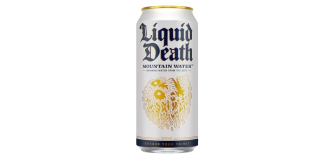
Liquid Death demonstrates how wide that flexible territory can become once the foundation is strong enough. A can of water designed like something from a heavy-metal festival, an aggressively comic tone of voice, macabre illustration, absurd products, celebrity collaborations and wilfully ridiculous social content all belong to the same universe because the brand has such a clear personality. Creativepool’s examination of how Liquid Death turned canned water into a $1.4 billion brand shows how deliberately the company built shareability into the product and communication from the beginning.
Importantly, though, the lesson is not that everyone should behave like Liquid Death. If Barclays started talking like a death-metal meme account tomorrow, people would probably have questions. The lesson is that the strongest social brands establish a character clear enough to guide thousands of small creative decisions. Once that character exists, variety becomes safer because there is something underneath holding it together.
Design the Behaviour, Not Just the Colour Palette
This is where a lot of social media branding projects remain surprisingly shallow. A brand redesign produces a beautiful set of static assets, the designers create some square Instagram mock-ups, everyone admires them in the presentation and then the social team discovers that approximately 80% of its actual output is video.
A modern social identity has to think in movement.
How does type arrive on screen? Do captions snap into place, slide, bounce or barely move at all? Are cuts aggressive or relaxed? Does the camera sit close to people or keep its distance? Is user-generated footage polished until it resembles advertising, or does the roughness belong to the brand? What happens in the first half-second of a Reel? What does an infographic look like when it needs to become a carousel? How does the identity survive a vertical video when there is nowhere convenient for the carefully positioned logo to go?
Motion itself can become distinctive. So can editing rhythm, transitions, framing and sound. Eurovision’s recent sonic identity is a good example of brands thinking beyond purely visual recognition. The brief was deliberately modular, creating audio cues that could work across broadcast and digital content so that fan-made and official material had a clearer sonic connection back to Eurovision. Creativepool’s feature on Eurovision’s audio DNA describes the goal as creating recognisability even when visual branding was absent.
TikTok itself approached the same problem when creating a sonic identity designed partly to identify TikTok-originated content outside the platform. Creativepool’s Behind the Brand feature on TikTok’s sonic identity demonstrates why this matters: as content travels between platforms, recognisable assets need to travel with it.
The strongest social design systems are therefore increasingly multisensory. Colour matters. Typography matters. But so do movement, sound, photography, language and even the way a brand responds in comments. Your social media identity is not simply the bit a designer places inside the frame. It is the total pattern people learn to associate with you.
Build for the Feed, Not the Brand-Guideline PDF
Social media also exposes the difference between designing something that looks beautiful and designing something that works while moving past somebody’s thumb.
Those are not always the same skill.
Intricate layouts can disappear on a phone screen. Thin typography becomes illegible. Carefully arranged photography gets covered by platform interfaces. A 14-word headline that looked beautifully balanced on the designer’s monitor becomes microscopic inside a Reel. Assets created purely for a pristine presentation can collapse fairly spectacularly once Instagram, TikTok, LinkedIn or YouTube places buttons, captions and interface furniture around them.
Recognisable social design needs hierarchy. You often have a fraction of a second to establish what somebody is looking at, and the most important brand cue should not require archaeological excavation.
This does not automatically mean putting the logo at the beginning of everything. Creativepool’s feature on the best uses of memes in advertising cites research around short-form social advertising showing the importance of early distinctive brand assets. The useful principle is broader than memes: whatever makes your brand identifiable needs to arrive quickly enough to matter. That might be the product itself, a character, a colour, a line, an unusual visual behaviour or a recognisable voice.
This is why the useful question isn’t necessarily “Can people recognise the brand without seeing the logo?” as though hiding the logo were some creative party trick. It is whether the identity contains enough other distinctive material that the logo isn’t doing all the work.
Try removing it.
If the post suddenly looks as though it could belong to any of twenty competitors, that tells you something.
The Best Social Identities Leave Room for Culture
There is another tension here, because social media does not reward brands simply for repeating themselves beautifully. Platforms are living environments. Memes appear and disappear. Formats change. Creators introduce new visual languages. Audiences develop jokes, behaviours and conventions far faster than most brand-guideline review cycles were ever designed to handle.
A recognisable brand therefore needs to be able to participate without becoming indistinguishable from everybody else participating.
This is where trend-chasing frequently damages brand awareness on social media rather than improving it. A meme performs well, so twenty brands recreate it using exactly the same format, language and image. The content feels native to the platform, but increasingly native to everyone. Remove the profile name and nothing belongs uniquely to the business.
Creativepool has written about this extensively because it is one of the central challenges of modern social marketing. In Mischief Mode, Mira Kopolovic of We Are Social describes a web where brands are increasingly trying to operate inside fast-moving, fragmented communities and absurdist internet culture. The opportunity is obvious, but so is the danger of arriving late and borrowing somebody else’s joke without understanding it.
A strong social identity gives the brand a filter. Instead of asking “How do we do this trend?”, the team can ask “What would we do with this trend?” Sometimes the answer will be something distinctive. Sometimes the answer will be nothing at all.
That ability to sit something out is underrated.
Ryanair, Liquid Death, Surreal and other brands associated with distinctive social voices work because their posts generally feel like extensions of identities they already own. Copy the behaviour without the strategic foundation and it quickly becomes another marketing team pretending to be an unusually sarcastic teenager.
Recognition is built when cultural flexibility happens inside a stable brand world, not when the brand world is discarded every morning in favour of whatever appeared on TikTok overnight.
A Social Media Design System Needs More Than Templates
Templates are useful. They make production faster, reduce unnecessary design decisions and help larger teams maintain reasonable consistency. They are particularly valuable for repeat formats such as announcements, quotes, product information, recruitment content or recurring editorial series.
But templates are production tools, not identity strategies.
A robust social system needs a broader set of rules governing what remains recognisable even when the template changes. That might mean establishing a primary and secondary type behaviour rather than prescribing an identical layout. It might define how tightly photographs are cropped, how illustrations interact with typography or how colour proportions are handled. There may be rules for motion, titles, data visualisation, thumbnails, captions and platform-native content.
Crucially, it should also explain what not to do.
What visual trends don’t fit the brand? Which colours should never dominate? How heavily should imagery be filtered? How much text feels like us? Do we put text over faces? Do we use emojis? Do we use stock photography? What does humour sound like? How polished is too polished?
These negative rules can be just as valuable as the positive ones because they stop a recognisable identity gradually dissolving through hundreds of individually reasonable decisions.
This matters even more now that social teams can generate and version content at extraordinary speed. Creativepool’s feature on why originality is becoming more valuable in a world drowning in content makes the uncomfortable point that brands can now create more material than ever without necessarily having more worth saying. More output does not automatically generate more identity. Sometimes it simply generates more opportunities to become inconsistent.
The design system should therefore make good decisions easier, not merely make production faster.
How Do You Keep a Brand Consistent Across Different Platforms?
The wrong answer is usually to post exactly the same thing everywhere.
LinkedIn is not Instagram with slightly more enthusiastic use of the word “leadership”. TikTok is not a vertical version of YouTube. Instagram Stories behave differently from the main feed. A YouTube thumbnail needs to operate differently from a carousel cover. Even when the creative idea remains consistent, the execution needs to respect how people use each environment.
The trick is to adapt the format without changing the identity.
A campaign image might become a static LinkedIn post, a motion piece on Instagram, a deliberately rough creator-led interpretation on TikTok and a thumbnail-plus-film combination on YouTube. The asset changes. The point of view, distinctive cues and underlying creative thought should survive.
This is also why distribution increasingly belongs in the creative conversation rather than somewhere after the work has been finished. Creativepool’s piece on why content distribution is becoming as important as creativity itself argues that brands now have to think simultaneously about what they are making and the environments in which people will actually encounter it.
Consistency across platforms therefore shouldn’t mean identical execution. It should mean consistent recognition.
A person moving between your TikTok, LinkedIn and Instagram accounts should feel as though they’re meeting the same brand behaving appropriately in three different rooms.
How Do You Know Whether Your Social Media Branding Is Recognisable?
You can start with a deeply unscientific but surprisingly revealing exercise: cover the logo and username.
Look at twenty pieces of recent content out of context. Does the collection still feel as though it comes from one brand? More importantly, would somebody who isn’t sitting inside the marketing team have any hope of recognising it?
Then make the test harder. Mix several assets among competitors. Reduce them to mobile size. Take away the captions. Show them briefly rather than allowing people to study them. What survives?
The strongest assets are usually the ones that still trigger recognition when other information disappears.
Proper measurement goes further. Ehrenberg-Bass measures distinctive assets according to both prevalence, how many category buyers connect an asset with the brand, and uniqueness, whether they connect it predominantly with that brand rather than competitors. That is useful because marketers are often terrible judges of their own distinctiveness. A colour might feel enormously ownable inside the brand team because everyone has stared at it for three years, while consumers associate exactly the same colour with four competitors.
Social analytics can offer supporting evidence, but likes alone don’t measure recognition. Look for repeat engagement, direct traffic, branded search, follower growth after distinctive campaigns, mentions that use brand language, organic reproduction of visual assets and audience behaviour indicating that people understand the joke or reference without needing it explained.
Perhaps the most interesting signal is when audiences start using your assets themselves.
When a colour, phrase, character, format or tone becomes something people mimic, quote or remix, the identity is beginning to live beyond the design team.
That is when a social media identity starts doing more than making a feed look tidy. It begins building memory.
And memory is ultimately the thing all that content is supposed to leave behind. The average person will never see your full content calendar. They won’t appreciate the elegant logic of your template library or admire the comprehensive brand-guideline document sitting in your shared drive. They will see a post for two seconds while doing something else.
The question is what those two seconds give them.
If the answer is merely “a nice piece of content”, you have produced something attractive.
If the answer is “I know exactly who that is”, you have built a brand.
Da:
https://creativepool.com/magazine/workshop/social-media-designs-that-make-a-brand-instantly-recognisable.35273


Commenti
Posta un commento